Harmony in Co-prosperity Becoming the vessel of happiness
SPC Group has been baking each and every piece of bread with love and care for the past 68 years, living by the spirit of sharing and co-prosperity. Our efforts are rewarded by the love of our customers, sometimes even more than we deserve, until we reached to the very top of Korean bakery and confectionery market.
The values of sharing and co-prosperity we have upheld since our founding will now be further imprinted in our minds with our new CI (Corporate Identity).
The two colors in our new logo are blue and yellow, referring to the blue sky and the golden sun, respectively.
The shape of the logo symbolizes one vessel that contains our commitment and care and one that contains the hope of co-prosperity. It also symbolizes the happy smiles of our employees, partners, and customers who share happiness and joy with each other.
Happy Smile, SPC
- CI Download
-

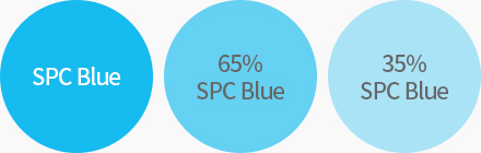
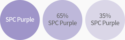
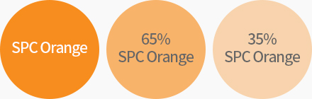
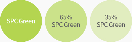
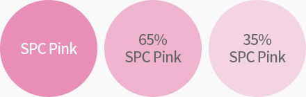
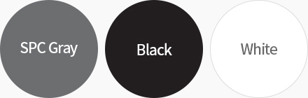
- CI Color
-